
Shapes are geometric objects. Like images, they are used to provide visual context for a page. Shapes include rectangles, ellipses, stars and more. All shapes have an outline and most have a fill, both of which can be configured independently as to style, width, and color. You can set either the outline or the fill to "none", removing that part of the shape from the display.
Shapes have no "Link" option to tie them to a tag. They are essentially static, although any property (movement, scaling, etc.) can be animated by specifying a tag value or an expression to provide its value.
The Style Settings tag has no effect on shapes and should not be linked to any property.
To add a shape to a page:
- Open the Idea Studio and open the page, to which you want to add a shape.
- Open the Shapes palette.
- Drag a shape from the palette to your page.
- Adjust the size, location and other properties of the shape as required.
A format ribbon is available for each widget type.
Advanced configuration details can be accessed by opening the Properties dialog of the widget.
Troubleshooting:
- The image is too big / too small.
All images have an initial size, which may be wrong for your application. After the image is placed, zoom in or out on the canvas until you can see the edges easily, then select the image and drag the corner grips to resize it.
Every shape can be scaled, stretched, rotated, colored, and more after being dragged to a page. All shapes have an outline, and all except for arcs have a fill. The appearance is controlled by tools in the formatting ribbon, or by each shape's properties dialog.
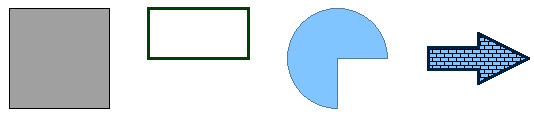
A variety of shapes, with a variety of outlines and fills.
Shapes have no "Link" option to tie them to a tag. They are essentially static, although any property (movement, scaling, etc.) can be animated by linking it to a tag value or to an expression.
The Style Settings tag has no effect on shapes and should not be linked to any property.
After drawing the shape on a page, you can adjust its appearance using either the ribbon tools or the shape's properties dialog. The properties dialog for a rectangle, with the Advanced options opened is shown in the following example. All shapes will have a similar properties dialog.
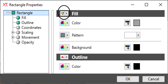
Advanced properties for fill.
Fill - Color, Pattern, Background
Only color will be available unless you expand the advanced options. Click to open the Select Color dialog.
Click the pattern option to view a selection of shapes that can be used for the fill: brick, zigzags, etc.
Each shape is drawn using lines of the current color selection, against a background color of your choice.
Outline - Color, Style, Width
Only color will be available unless you expand the advanced options. Click to open the Select Color dialog.
The style option can be used to select the pen style, (solid or dashed), that will be used.
The default width is one pixel, but may be increased to a maximum of 30.
