Bar Graph Widget
This widget can include any set of numeric tags, but cannot be linked to a tag.
* Does not use the Style Settings tag.
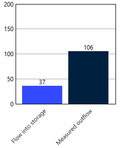
This widget is used to display the values of a set of tags in the form of a two-dimensional bar graph. The graph updates continuously with changing values.
The properties dialog for the Bar Graph widget:
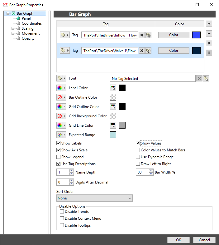
Tags & Colors
Use the + button to select all the numeric tags that should be included in the graph. Each defaults to the color black; you will need to select appropriate colors as you add the tags.
Use the - button to remove a tag from the set and the arrows to adjust the order.
Font
Select the font to use for labels and legends.
Label Color
Sets the color of all text used for labels, unless you choose to color labels to match segments.
Bar Outline Color
Defaults to transparent.
Grid Outline Color
Draws a bounding line around the full graph. Defaults to black.
Grid Background Color
The background color of the graph portion of the widget. Defaults to transparent.
Grid Line Color
The color to use for marker lines within the grid. Defaults to gray.
Expected Range
If an analog I/O tag has been configured with an expected range, it will be shown on top of the matching bar using this color.
Show Labels
When selected, labels are shown outside the chart, beside each matching segment. Content and color of the labels depend on the following selections:
Show Axis Scale
No scale is shown unless selected.
If selected, then a single scale is shown, spanning from the minimum scaled value of all the selected tags to the maximum scaled value of the tags.
Extra space is always provided above the full scale range, but not below.
Show Legend
Controls whether a legend is shown below the bar graph. The legend cannot be moved elsewhere.
Tag names or descriptions are shown depending on the next selection.
Use Tag Descriptions
Applies to both labels and legends. If not selected, tag names are shown instead. For this case, the immediate (short) name of the tag is always shown. Names of parent tags are shown or not according to the following parameter:
Name Depth
Relevant only when Use Tag Descriptions is not selected (tag names are shown rather than descriptions). Minimum value of 1.
This controls how many of each tag's parents are included in the label.
Digits After Decimal
Applies to both labels and the legend. Defaults to 0 digits following the decimal.
Sort Order
Bars are shown in the order that tags are entered in the selection list unless otherwise configured by this parameter which sets the sort order by name, ascending or descending.
Show Values
Controls whether values are displayed with each bar.
Color Values to Match Bars
When selected, values (if displayed) are shown with the same color that was selected for the matching bar. Otherwise values are shown in same color being used for the labels.
Use Dynamic Range
When selected, the scale will continuously vary to match the largest current value of any of the tags in the selection set.
Draw Left to Right
Vertical bars are drawn by default. Select this option to draw the graph as horizontal bars.
Bar Width (%)
Defaults to 80%. The minimum value is 1% and the maximum is 99%. Space is allotted for each bar by dividing the width of the widget by the number of bars (tags) displayed. This parameter controls the space shown between each bar by restricting the colored area to a percentage of it's width.
Disable Options
Disable selected operator-interaction features of this widget.
See: Operator Interaction Controls
Analytics\Charts and Graphs
