
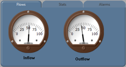
The Folders widget creates a user-interface object with multiple tabs where each tab has a separate display of system monitoring and control objects. The tabs are used to select which frame to display.
Three styles of folder are provided in the palette, but these are all variations on the same widget.
(See Style, later in this topic.)
A folder may have from one to fifteen tabs. You have extensive control over the appearance of the folder and the tabs within it.
The content for each tab's frame must come from an existing object in your application. These may be pages, tag widgets, or plain widgets. You do not draw objects on a folder as you would on a page.
There are two parts to a folder's configuration: The first defines the overall style of the folder. The second controls the content and the appearance of the individual tabs.
Note: If your pages include tabbed folders, then the Unique Key property of the folder must be set in order for tabs to function when viewed using a Mobile Internet Client.
As a general rule, define the tab setup first, then adjust the style to your preferences.
Define a Folder's Overall Style
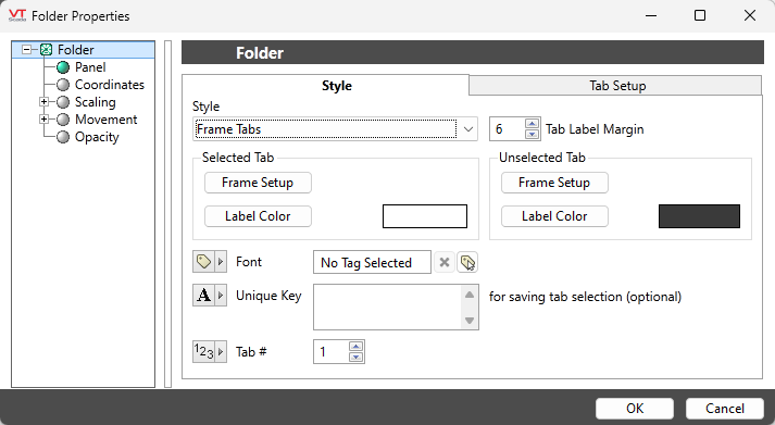
The Style tab of the folder configuration:
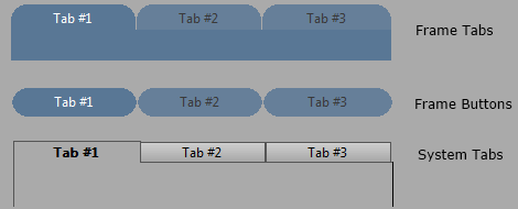
The folder may use any of the following three styles. Each folder style can be further refined with a selection of tab styles, which may differ between the selected and the unselected tabs.
Tab Label Margin
Sets the number of pixels above the tab labels. A large margin value may increase the height of the tabs, but will not increase the width - if necessary, the label will be truncated to provide the required margin within a given tab width. The overall folder width, divided by the number of configured tabs, controls the width available for each tab.
Selected Tab's Frame Setup
The shape of the tabs themselves and the area below the selected tab are controlled by the Frame Setup selection. If either Frame Tabs or Frame Buttons are selected for the overall style, then you may further refine the shape by selecting one of the six built-in frame designs. See Frame for details. The System Tabs style does not allow for further refinement of the frame.
Selected Tab's Label Color
Opens the Select Color dialog, from which you can choose the color, in which the selected tab's text will be displayed. To emphasize that a tab is selected, it is best to choose a color with high contrast from the tab's color.
Unselected Tab's Frame Setup
Provides the same set of options as for the Selected Tab's Frame Setup. Use care with this selection: by choosing a raised frame for the selected tab and a flat or sunken frame for the unselected tabs, you can provide a clear visual message to the operator to help them see which tab is selected. Choosing a frame for the unselected tab that is a completely different style from that of the selected tab may cause confusion.
Unselected Tab's Label Color
Sets the color of the text to use for the labels on the unselected tabs. This should have a low level of contrast against the tab's background color to indicate that the tabs are not selected, yet still have enough contrast to read easily.
Font Style
Select a Font tag to define the appearance of the tab labels.
Note: While it is possible (and very easy) to modify the appearance of the text within this widget using the Format ribbon of the Idea Studio, you will find it much easier to manage a group of similar controls by defining a font tag and selecting that for each. Changes to all can then be made by adjusting the properties of a single font tag.
Unique key for saving selected tab
Variables such as dialog positions and sizes are normally retained per-user and per-module. What this means for the folder is that the "Last viewed tab" would be saved, but shared across all folders.
By providing a unique key to this parameter, each folder drawn in an application can save its own last viewed tab. If used, the key may be any phrase such as, "Main Station Display" or "Treatment Plant Panel".
If the folder is used in a parameterized page, it will be necessary to have a different key for each version of the page that you open. Therefore, this property may be linked to a page parameter or expression.
Tab #
Sets the starting / current tab number, with "1" as the default.
You may use an expression to change the current tab dynamically as required.
Define a Folder's Tabs
The number of tabs, the label for each, and the content of each tab's frame are defined with the Tab Setup.
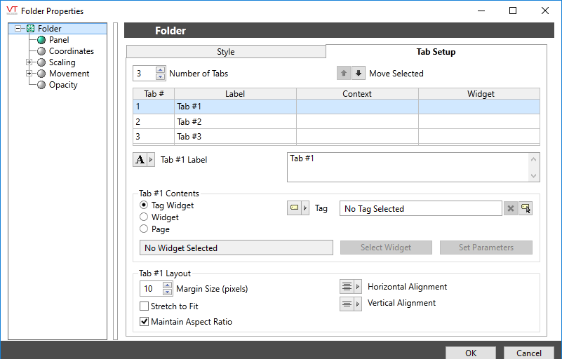
The table in the center of this panel displays a summary of each tab's configuration and can be used to re-order their appearance in the folder. Use the controls above or below the table to modify the tabs.
Number of Tabs
May be any value from one to fifteen. This changes only the number of tabs displayed, not the number that exist. If you configure four tabs, then drop the number to three, you will have hidden the fourth tab, not deleted it.
Move Selected
Tabs may be re-ordered. They are displayed left-to-right across the folder in the order that they appear from top to bottom in the table.
Tab Layout
Provides control over how the contents of the tab fit into the folder size.
- The margin, measured in pixels, will ensure a set amount of blank space around the contents. If the area of the folder plus the margin is smaller than the selected content, then the content will be scaled down to fit.
- If Stretch to Fit is selected, the folder content will be expanded to fit the available size.
- The Maintain Aspect Ratio option controls whether the content may be deformed when being stretched or shrunk.
- Finally, the Horizontal Alignment and Vertical Alignment options control how content that is smaller than the folder will be placed within the available space.
Tab Contents
For the selected tab, you may provide the text for the label and the contents of the tab's frame.
Any one of three types of object may be used for the tab's contents: Tag Widget, Plain Widget or Page. The specification of the contents depends on the content type. See following examples.
Steps to use a Tag Widget:
- Select Tag Widget as the Widget Type.
The Context field (reading "No tag selected") will be enabled. You can configure this to use a tag, a parameter or a linked tag property. The linked tag property option is used only when the folder is being drawn within a user-defined widget. - Select a tag, parameter, or linked tag property.
The Select Widgets button will be enabled. For example, if you select an Analog Status tag for the content, you can then choose from any of the Analog Status widgets. - Click the Select Widget button to choose from the available representations of this tag.
The Set Parameters button will be enabled. - Click, Set Parameters to configure the widget's appearance.
Steps to use a Plain Widget:
- Select "Widget" as the Widget Type.
The Context field (reading "No tag selected") will be enabled. You can configure this to use a tag, a parameter or a linked tag property. - Click the Select Widget button.
A palette will open. You may use any folder. - Select the Widget that you want to show on the tab.
If this widget uses parameters, you will be prompted to provide set those parameters for this instance.
You may later use the Set Parameters button to change those selections.
Steps to use a Page:
- Select Page as the Widget Type.
The Context field will be set to "Pages" and disabled. - Click the Select Page button to open a menu of all the pages in this application.
Any page may be used, but in general, it is best to use a page that was designed to fit the area of this folder. - Select the Page that you want to show on the tab.
If this page uses parameters, you will be prompted to set those parameters for this instance of the page.
You may later use the Set Parameters button to change those selections.
Note that, the page's background image will not carry through to display in the tabbed folder.
Decorations
