HP Radial Gauge
Used by: I/O and Calculation tag
* Can use properties from a Style Settings tag.
The High Performance Radial Gauge widget is a radial version of the HP Analog Bar widget.
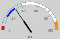
This example uses default colors and shows an expected range, recent values, a high alarm (high priority) and a low alarm (critical priority). The widget gives you the option of displaying the alarm ranges using either the matching priority colors or gray.
By definition, an expected range should not overlap an alarm setpoint. If you do configure an overlap, do not expect both to show in any widget.
The properties dialog for the HP Radial Gauge widget:
(Click to expand image)
Minimum Angle / Maximum Angle
Measured in degrees, clockwise from vertical. Use these to set the angular range for the tag's value.
Defaults to 270 deg for the minimum value and 90 for the maximum angle, as shown in the example.
Bar Width
Expressed as a percentage of the widget's overall width or height (whichever is smaller).
Indicator Image
The default image is a needle. Use this to select and then configure any alternate image that you prefer.
Offset from Center
Measured as a percentage of the image size, this allows the needle (or other selected image) to rotate about a point that is not at the edge of the image.
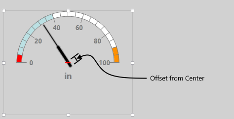
The widget as seen in the Idea Studio. The red cross at the center of indicator rotation is not displayed to operators.
Indicator Scaling
Permitted values range from 0.5 to 1.5. The default is 1.
This scales the image used for the indicator by as much 50% of the original size up to 150% of the original.
Scaling takes the Offset from Center into consideration, keeping the scaled indicator image at the same relative origin as the original.
Display Options
Show Value / Show Units
Use these options to control whether the current value and the tag's configured engineering units are shown below the gauge.
Value & Units Offset
Measured in pixels, this sets the distance from the bottom of the widget's bounding box, up to the location of the value and units (if displayed). Both value and units are always centered horizontally.
Show Scale
Controls whether a scale and a numeric legend is shown within the arc of the gauge.
There is no option to show one without the other. The linked tag's scaling is used in all cases.
Number of Major Divisions
The number of large spaces in the scale bounded by large tick marks. See note for Major Tick Size.
Number of Minor Divisions
The number of spaces bounded by smaller tick marks between each set of major tick marks.
Major Tick Size
Measured in terms of a percentage of the size of the overall widget's bounding box. Given a default of 10% for the major tick size and a default of 5% for the bar width, this makes the tick marks twice as long as the bar is wide.
Recent Data (minutes)
If set to a value greater than 0, a thin bar (half the width of the overall bar) will show values recorded over the X number of recent minutes.
Must be set to a whole number.
Colors
Style
Defaults to the Style tag selected in the tag linked to this widget.
Tick Marks and Labels
Sets the color used to display tick marks and labels.
Outline
Sets the color used to display the outline of the bar.
Background
Sets the color used to display the background of the bar.
Expected Range
Can be used to override the color that indicates the linked tag's expected range.
Recent Data
Can be used to override the color that indicates the linked tag's recent values. (See: Recent Data property, earlier in this topic.)
Always Show Alarm Colors
If selected, the portion of the bar above or below alarm setpoints is shaded using the Alarm Priority colors. When in an alarm state, only the priority color for the active alarm will show.
If not selected, those portions of the bar are shaded using the Alarm Off color (defaulting to gray). Active alarms are indicated using the appropriate Alarm Priority colors.
Alarm Off
Can be used to override the color that indicates the linked tag's alarm range.
Disable Options
Disable selected operator-interaction features of this widget.
See: Operator Interaction Controls
Gauges
High Performance
