Checkbox Switch Widget
* Does not use the Style Settings tag.
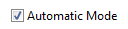
The Checkbox Switch widget is used to create an On/Off control for a two-position SelectorSwitch tag. Each time an operator clicks on the box or attached label, the switch will toggle between positions and a check mark will be displayed for position 1.
This is a control-type widget that is only available for selector switches - it is not available for use as an indicator with Digital Input or Digital Status tags.
When displaying more than one check box on a page, each one must be given a unique value for its Focus ID.
The properties dialog for the check box is as shown:

CheckBox Label
Provide a descriptive label for the check box. May be left blank.
Box Placement
Select whether the box is to go to the right or the left of the label. The label itself will change justification to match the box (left-justified when the check box is on the left and right-justified when the box is on the right).
Invalid Color
Sets the color that will be displayed when the attached Selector Switch tag is in an Invalid state. May indicate either an error in communication or a Selector Switch with no feedback that has not yet been set to any position.
Mismatch Color
Sets the color that will be displayed when the Selector Switch's position feedback indicates that the equipment is in a state other than the one most recently set using this widget.
Selection Dialog
When the check box is clicked for the first time and there is no feedback to show the current position of the Selector Switch tag, a dialog box will open with a choice of initial state. In that dialog, the "Not Checked Text" describes position 0 and the "Checked Text" describes position 1 of the Selector Switch.
If selected, the operator must confirm the action before a control signal is sent to the PLC. An example of the confirmation dialog follows:

(Text will vary according to your configuration.)
Focus ID
Select a number representing the placement of this object in the page’s overall tab order. (Optional)
When you draw objects on a page, each object is given a focus ID that identifies that object's place in the tab order (that is, which object will be selected when the Tab key is pressed). This does not control which object will initially have focus when a page is opened - that belongs to the first item drawn on the page that can receive focus. (i.e. the first graphics statement in the page’s source file).
You can disable a control widget by setting its Focus ID value to zero. The widget will remain visible, but faded.
Disable Options
Disable selected operator-interaction features of this widget.
See: Operator Interaction Controls
Buttons & Switches\Basic Controls\
Basic Components\Button Controls\
