
Used by: I/O and Calculations, Alarm Status, Analog Input, Analog Output, Analog Status, Analog Control, Calculation, Comm Link Sequencer, Counter, Deadband Control, History Statistics, Linear Legend, Rate of Change, Selector Switch, Totalizer, SQL Logger.
* Does not use the Style Settings tag.
The Draw Text widget is used to display the current value of any of a tag as text. Units (if any) will not be displayed and numeric values will display either 0 or 8 decimal points with no option for user-configuration. If you require just one decimal points of accuracy, or if you would like to display the engineering units that the value represents, then the Numeric Value Widget will be a better choice.
The properties dialog for the Draw Text object:
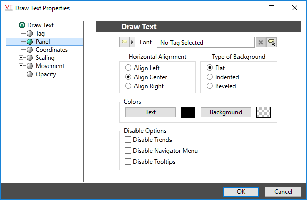
Font
Select one of the font tags (or parameter linked to a font tag) that you wish to use to display the text. The display will use the default system font if you do not select a font tag.
The parameters button is enabled only if the tag is drawn on a page that includes a font parameter, or if the tag is part of a widget and the associated widget editor is open.
Note: While it is possible (and very easy) to modify the appearance of the text within this widget using the Format ribbon of the Idea Studio, you will find it much easier to manage a group of similar controls by defining a font tag and selecting that for each. Changes to all can then be made by adjusting the properties of a single font tag.
Horizontal Alignment
Sets the position of the text within the display area. You may select left-aligned, right-aligned or centered. To align the display area itself with other elements on the page, see: Alignment and Positioning Tools.
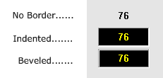
Type of Border
Examples of the three border types are shown at the beginning of this topic.
Colors (Text and Background)
Opens the Select Color Dialog from which you can select the color of the text.
You can also set the background color against which the text will be displayed.
Disable Options
Disable selected operator-interaction features of this widget.
See: Operator Interaction Controls
Basic Components\Text\
