
* Can use properties from a Style Settings tag.
Used by: I/O and Calculations, Alarm Status, Analog Control, Analog Input, Analog Output, Analog Status, Calculation, Comm Link Sequencer, Deadband Control, Function, History Statistics, Script, Selector Switch, SQL Logger.
The LCD Bar widget represents the associated tag's value as an dot matrix (LED) display. If configured, an active alarm will cause the dots above the alarm set point to use the alarm color. Two versions are included in the palette: one with a single column of wide images and one with an array of small images.
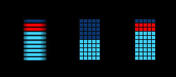
The default colors look best against a dark background, but may be configured as required within the linked Style Settings tag.
These widgets will indicate an active alarm according to the properties of the attached Style Settings tag (Exceptions tab). To continue indicating an alarm that is unacknowledged but no longer active, change the property AlarmWidgetsShowUnackedNormalAlarm in the application's properties, setting the value to 1.
The properties dialog for the LCD Bar widget:
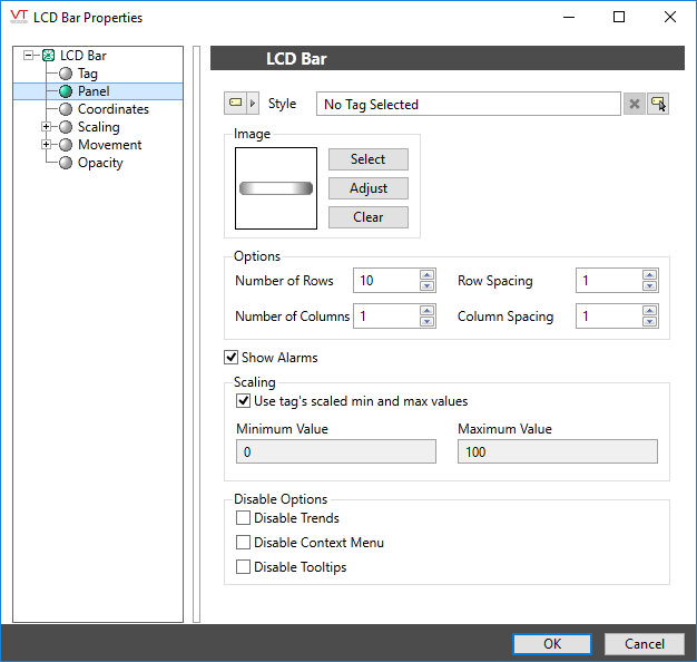
Style
Optionally, select a Style Settings tag to control the colors shown by the light, in response to the linked tag's value and alarm state.
See:Style Settings Tags
Select Bitmap
Choose the image to display for each square of the bar. The default image for the array version of this widget is a 5x5 pixel, light gray rectangle. For the series of stacked bars, it is a 65x11 pixel bar with shaded edges.
If choosing another image, ensure that it is a light shade of gray, to be compatible with the Style Settings tag.Suggested alternative images can be found in the images folder, Widget Parts >> Meter Parts >> LCD Elements.
Options
Set the number of rows and columns that will be displayed in the array, and the space between each element, measured in pixels.
Show Alarms
When selected, rows that represent values past the alarm set point are displayed using the alarm color in the Style Settings tag.
Scaling
In most cases, a widget will show the scaled values configured within the linked tag. You can override this setting to map the tag's values into any range you prefer to display.
Disable Options
Disable selected operator-interaction features of this widget.
See: Operator Interaction Controls
Basic Components\Bars\
