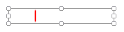
Linear Indicator
The linear indicator widget represents the associated tag's value as a line that moves across the scale range. Any image may be used in place of the line, but it should have a clear pointer to help the operator read the current position of the meter.
The properties dialog for the Linear Indicator:

Data source
The indicator must be linked to a tag before it can be grouped into a new meter as part of a tag widget.
Select (Image)
Opens the Select Image Dialog, from which you can choose the image to use for the indicator.
Adjust (Image)
Opens the Adjust Image dialog, with its full range of controls over image appearance.
Clear (Image)
Remove the image.
Options
Orientation: The direction that the needle image will travel. If vertical is to be selected, it is essential that you choose a horizontal needle.
Reverse direction: Control the direction in which increasing values are represented.
Draw mode:
- Moving - the value is represented as a moving line:
- Scale - represented by an expanding bar that fades slightly towards the maximum range.
- Crop - represented by an expanding bar, that stays sharp to its maximum range, but blurs along the sides.
Dampen movement: When selected, applies an animation effect to needle motion so that the image appears to sweep from one value to another rather than jumping immediately.
Number of steps: If set to 0, the indicator shows the exact value. If set to a larger value, the indicator is divided into the given number of steps and the display will round to the nearest step. So, for example, a step of 1 would mean all on or all off. 20 steps on an indicator that ranges from 0 to 100 would round the display to the nearest multiple of 5.


Scaling
Used to set the tag values corresponding to the minimum and maximum angles. It is recommended that you use the tag's scaled values.
Tools\Meter Parts
