
* Does not use the Style Settings tag.
The Selector Switch widget is used to represent a Selector tag as either a 2-position or a 3-position switch. A common use is to create a Hand-Off-Auto selector.
If the matching Selector tag has been configured for only two positions, the middle position cannot be used. The label will be blank in this case, even if you have specified an override within the widget configuration.
The widget is composed of several user-configurable parts: the base image, the switch image (i.e. the knob) and the labels. Additionally, you can change the switch angle. Any value from 0 to 120 is permitted, but small angles may be difficult for operators to use. The labels will be relocated to match the new switch positions.
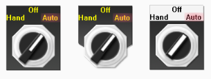
The selector switch has built-in mechanisms to provide feedback to the operator. If an alarm occurs due to a mismatch between expected and actual feedback values, the text in the selected position will glow red. In the event of a mismatch between the requested and actual switch position, visual feedback will be provided by the switch blinking between the current position in solid shades and the requested position as semi-transparent. (see the following image:)

If the position feedback is Invalid, the image will simply blink in its set position.
If the Selector tag has only two positions, then the left position in the widget corresponds to position 0 in the Selector tag and the right position is 1. If the Selector tag has three positions, then left corresponds to position 0, the middle to 1 and the right corresponds to position 2.

Stationary Image
Any image may be chosen for the base image, but three in particular are provided in the Selector Switches folder: Plate1a, Plate1a-Large and Plate1b. (See example at the beginning of this topic). The base image provides a background for the switch and the labels.
Image Select
Opens the Select Image dialog, within which you can browse for images, import new images, and select the image to use.
* VTScada recognizes the following image formats: .BMP, .CUT, .PCX, .EMF, .WMF, .JPG, .PNG, .TIF
Image Adjust
Opens the Adjust Image dialog box, which can be used to change the color and other display characteristics of the image. See: Adjust Image Dialog
Image Clear
Remove the selected image and do not select a replacement.
Rotary Image
Any image may be chosen for the switch image. The Selector Switches folder provides three options: Switch1a, Switch1a-Large and Switch1b. This provides a control and indicator knob that will appear on the base image background. Variations of the image shown above can be found in the Selector Switches group of the images library and you are free to add your own images.
Switch Angle
This is the angle between each consecutive position of the switch. Any value from 0 to 120 may be set. As shown in the following images, an angle that is too small (5 deg, shown on the left) will be difficult to use, while an angle that is larger (120 deg, shown on the right) may cause the labels to display outside the area of the base image.

Font
Select one of the font tags (or parameter linked to a font tag) that you wish to use to display the text. The display will use the default system font if you do not select a font tag.
The parameters button is enabled only if the tag is drawn on a page that includes a font parameter, or if the tag is part of a widget and the associated widget editor is open.
Note: While it is possible (and very easy) to modify the appearance of the text within this widget using the Format ribbon of the Idea Studio, you will find it much easier to manage a group of similar controls by defining a font tag and selecting that for each. Changes to all can then be made by adjusting the properties of a single font tag.
Color
Opens the Select Color Dialog from which you can select the color of the text.
Position Label Overrides
Set labels within the widget configuration that should be used in place of those configured in the linked tag.
Confirmation Dialog check box.
The confirmation dialog check box can be selected if you wish the user to be prompted for confirmation of the new value being set.
Constrain Aspect Ratio.
Prevents the image from being deformed when resized on the screen.
Disable Options
Disable selected operator-interaction features of this widget.
See: Operator Interaction Controls
Buttons & Switches\
Basic Components\Button Controls\
