
Used by: I/O and Calculations, Analog Input, Analog Status, Analog Output, Analog Control, Selector Switch.
* Does not use the Style Settings tag.
The Slider widget is used to create an output control. An operator can drag the slider to set a value which will be output by the associated tag.
Any image may be used for the slider image, although images from the Sliders group or the Arrows group of VTScada images are recommended. The slider may be drawn vertically or horizontally and can be configured with the maximum value at either end of the range.
Feedback is provided to the operator while moving the slider, via a tooltip window. You also have the option of querying the operator for verification before any change is saved. If the slider is used to draw a Selector Switch, or an Analog Input or Analog Status tag, configured to write data, then a mismatch between the current value and the last value read will indicated by a blinking image.
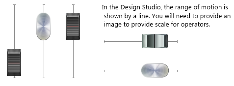
To make the slider intuitive to use, it is recommended that it be placed on or near an instrument image that clearly shows the available range of motion, and provides scale markers for reference.
The properties dialog for the Slider widget:
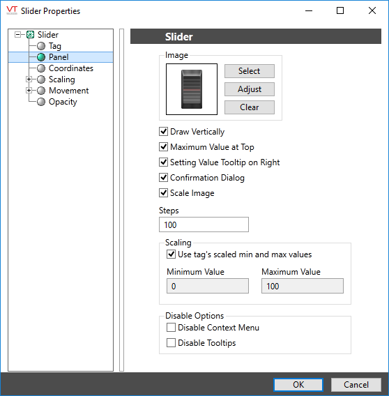
Image Select
Opens the Select Image dialog, within which you can browse for images, import new images, and select the image to use.
* VTScada recognizes the following image formats: .BMP, .CUT, .PCX, .EMF, .WMF, .JPG, .PNG, .TIF
Image Adjust
Opens the Adjust Image dialog box, which can be used to change the color and other display characteristics of the image. See: Adjust Image Dialog
Image Clear
Remove the selected image and do not select a replacement.
Draw Vertically
Select this option if you want the completed Slider object to operate vertically. If you would prefer the Slider to operate horizontally, leave this box unselected.
Maximum Value at Top
When selected, moving the slider up (or to the right if Draw Vertically is not selected) will result in an increase of the value to write. Otherwise, values will increase towards the bottom or left as the slider moves.
Setting Value Tooltip On Right
When selected, a tool tip displaying the value to which the slider is being set, appears on the right of a vertical slider or above a horizontal slider. When not selected, the tooltip appears to the left of the vertical slider, below the horizontal slider.
This check box will be labeled Setting Value Tooltip On Top if the Draw Vertically check box is not selected.
Query Changes
If selected, the operator to be prompted for confirmation of any new value being set.
Scale Image
The Scale Image check box can be selected if you want the slider image to scale along with the overall widget. If not selected, the image will remain the same size and shape as the size of the overall slider is adjusted.
Steps
Sets the precision of the control, relative to the scaling value. The default value enables the operator to select 100 possible values within the scale range. Note that operators may have difficulty selecting a value if you set a large number of steps in a short slider.
Scaling Options
Choose whether to use the tag's minimum and maximum scaling values or to set alternative scaling values that will be applied to the output value.
Disable Options
Disable selected operator-interaction features of this widget.
See: Operator Interaction Controls
Analog Controls\
