
"2 state" versus "4 state". Not all tags will have all the states shown in these examples. Alarms have only state 0 and state 1 and therefore must use the "2 state" version of this widget.
Digitals might only use two states, but they can have four and therefore must use the "4 state" version of the widget.
Used by: Drivers, I/O and Calculations, Alarm, Alarm Status, Analog Input, Analog Output, Analog Status, Analog Control, Calculation, Counter, Deadband, Digital Input, Digital Output, Digital Status, Digital Control, Function, History Statistics, Modem, Network Status, Pump Status, Network Status, Rate of Change, Roster, Selector Switch, Serial port, SQL Logger, Totalizer.
* Does not use the Style Settings tag.
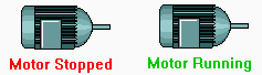
The Text Change tag widget is used to represent the associated tag's value as a text string that changes (text or color) based on the tag's value. While this widget is available to analogs, it is most commonly used with digital and other tags that have clearly defined states (values from 0 up to 3).
If linked to a tag that has values above 3, this widget uses the modulus (remainder) of the tag's value divided by four. For example, 7 is read as 3.
The properties dialog for the Text Change widget:
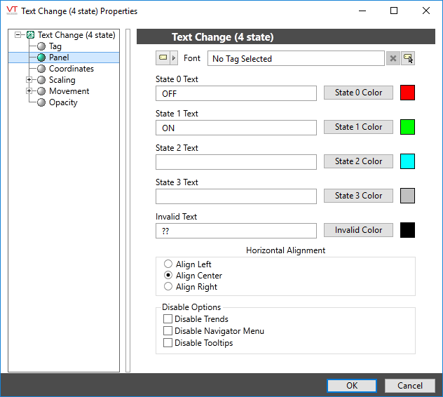
Font
Select one of the font tags (or parameter linked to a font tag) that you wish to use to display the text. The display will use the default system font if you do not select a font tag.
The parameters button is enabled only if the tag is drawn on a page that includes a font parameter, or if the tag is part of a widget and the associated widget editor is open.
Note: While it is possible (and very easy) to modify the appearance of the text within this widget using the Format ribbon of the Idea Studio, you will find it much easier to manage a group of similar controls by defining a font tag and selecting that for each. Changes to all can then be made by adjusting the properties of a single font tag.
State x Text
Provides input fields where you can type the text to display when the tag is in the corresponding state.
State x Color
Opens the Select Color Dialog, from which you can choose a color to display when the tag’s value is in the corresponding state.
Invalid Text
Provides the same function as State x Text for the case when the tag’s value is Invalid.
Invalid Color
Provides the same function as State x Color for the case when the tag’s value is Invalid.
Horizontal Alignment
Configure the text to be left, center or right-aligned within the widget's bounding box.
Disable Options
Disable selected operator-interaction features of this widget.
See: Operator Interaction Controls
Indicators\Basic Indicators\
Basic Components\Text\
