
* Does not use the Style Settings tag.
The Vertical Buttons widget, one of the native widgets for Selector Switch tags, is a control method used to output one of three possible values. The values will be those configured for the three positions of the selector switch, 0 to 2 in order from top to bottom.
If the underlying selector has only two positions, then only the top and the middle button will be functional. The operator may click the bottom button, but this will have no effect on the switch position or output. Due to the confusion that this may cause, vertical buttons should be used only with three-position selector switches.
Color is used to indicate that either a mismatch in state has occurred, or that an alarm is active as shown in the following examples.
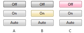
Vertical buttons in a normal operating state (A), showing a state mismatch (B) and showing an active alarm (C). (See: Selector Switch Tags, for a discussion of mismatch conditions.)
The following image shows the properties dialog where you can set the properties of the object.

Position Text n
Set the labels that will appear on the buttons. The buttons are drawn from top to bottom and match the Position 0 through Position 2 settings of the associated selector switch.
Mismatch Color
Use the slider to set the color that will be superimposed on a button in the event of a position mismatch in the selector switch. A sample image displays the result as you adjust the slider.
Confirmation Dialog
If selected, the operator will be prompted to confirm every change made by clicking on the buttons. See also: Confirmation Prompts for Output Tags.
Disable Options
Disable selected operator-interaction features of this widget.
See: Operator Interaction Controls
Buttons & Switches\Basic Controls\
Basic Components\Button Controls\
