Execute / Cancel Button Widget
This button appears in the Widgets palette as both an Execute Button and a Cancel Button. They are the same.
Used by: I/O and Calculations (all data types). For other output tag types, use the Legacy Set Value Button, which incorporates an Execute / Cancel option.
* Does not use the Style Settings tag.
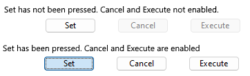
The Execute / Cancel Button widget is used in combination with either a Set Value Button Widget or a Numeric Entry Widget when that widget's confirmation option is configured to Set Before Execute. This button must be linked to the same I/O tag as the Set Value button or Numeric Entry widget, and that tag must be configured to write.
The exception is if the Set Value uses a separate Feedback tag, in which case this button must be linked to that feedback tag. Refer to the configuration example in the topic, Set Value Button Widget.
A configuration example is provided in the topic, Set Value Button Widget.
The properties dialog for the Execute / Cancel Button widget:
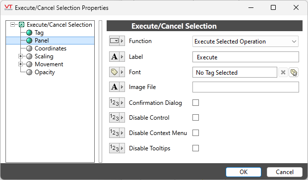
Function
Choose between Execute and Cancel
Label
Optional text to be displayed on the button.
Font
Select a Font tag that sets the display characteristics of the label.
Image File
Optional path and filename to an image that will be shown on the button. The path must be relative to the application's folder; for example: "Bitmaps\MyIcons\Execute.png".
If both a label and an image are specified, the image will appear to the left of the label. If there is no label, the image will be centered on the button.
Confirmation Dialog
If selected, the operator must confirm the action before the Execute or the Cancel operation proceeds.
Disable Control
When selected, this output control will be inoperable. May be tied to a tag or expression.
Disable Options
Disable selected operator-interaction features of this widget.
See: Operator Interaction Controls
Buttons & Switches
Buttons & Switches\Basic Controls
