
Used by: I/O and Calculations (numeric data types), Analog Input tag, Analog Status, Analog Output, Analog Control, Counter, Selector Switch, Totalizer.
* Does not use the Style Settings tag.
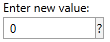
The Numeric Entry widget is used to create an entry field into which operators may enter numeric values to write to the associated PLC or RTU. If the Questionable flag is set on the linked tag, the indicator will be displayed to the side of the text field, within its own box.
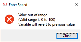
Attempts to enter text in this field will produce the following error message:
This widget is most commonly used with I/O tags that have an analog or discrete data type. The minimum and maximum permitted values match the tag's configured Scaled Process Data Min and Scaled Process Data Max properties.
For a totalizer or counter tag, it can be used to allow the operator to set the value. In the case of a totalizer that is updating every second, this may prove to be impractical.
For a selector switch, this object provides a way to numerically set the switch position to 0, 1 or 2.
The properties dialog for the Numeric Entry widget:
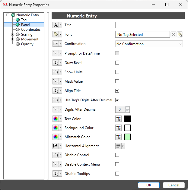
Title
Provide text that will tell the operator what to use this Numeric Entry field for.
Font
Controls the display characteristics of the data entry field, but not the label. If you set individual characteristics using the Format ribbon, this will be an expression, combining those characteristics. Otherwise, select a font tag.
Confirmation
Choose between...
No Confirmation: The value is written when entered (usually by pressing Enter or Tab).
Confirmation Dialog: The operator must confirm the action before the value will be written.
Select Before Operate: Requires a separate Execute Button Widget. The operator must enter a new value in this widget to enable the output, then click the Execute button to complete the action. A Cancel button can be provided, thereby giving operators a chance to "disarm" the widget. (Execute / Cancel Button Widget)
Enabled only for memory tags. Use when there is a need to record user-supplied data, where that data may have been collected over period of time leading up to the present. Both the collected values and the relevant date and time may be specified. The default date and time are "now" upon first use, following which, the last date and time supplied will be used for each subsequent entry.
When selected, a calendar icon is added to the widget.
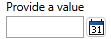
Click this to open the Select Date and Time dialog, where you can entry a value for the memory tag that will be associated with the date and time of your choice.
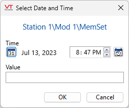
Click the calendar button within this dialog to set the default to "today" and open a calendar from which you can select any date.
Click the time button within this dialog to set the default to "now". To set a different time, use the time entry fields or the up/down arrows to advance the time according to the currently selected portion of the field.
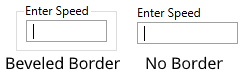
Draw Bevel
Select whether the completed object should be drawn with a beveled border. If the Draw Bevel check box is selected, the completed object will be drawn with a border surrounding it.
Show Units
Adds the units, as configured in the tag, to a box on the right of the data input field.
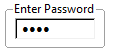
Mask Value
When selected, the value will be masked by asterisks rather than being displayed on the screen or in the event log. This option will most often be selected when the Numeric Entry is being used to write a password to a hardware device, thus preventing other users from discovering the password.
Align Title
If selected, the title is included in the widget's bounding box.
If not selected, the title is above the widget's bounding box.
Use Tag's Digits After Decimal
Relevant only when linked to an I/O and Calculations tag. The linked tag controls the number of decimal values shown.
Digits After Decimal
Enabled only if the preceding option is not selected. Controls how many digits will be displayed after the decimal point. Has no effect on the number that the operator may enter.
Text Color
Select the color to be used for the input text. Does not apply to the label.
Background Color
Select the color to be used for the background of the input field. Does not apply to the label.
Note: Transparency cannot be applied to the background color.
Mismatch Color
Used only when the associated tag is a Selector Switch, or an Analog Input or Analog Status type, configured to write values. When the last value written does not match the value being read, the widget will display the configured mismatch color.
Horizontal Alignment
By default, text is left-aligned within the edit field. You can choose to center or right-align the text instead. Does not affect the title.
Disable Control
When selected, this output control will be inoperable. May be tied to a tag or expression.
Disable Options
Disable selected operator-interaction features of this widget.
See: Operator Interaction Controls
Analog Controls\
