Widget Reference
Topics in this section
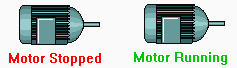
The Active Indicator widget is used to create a rectangular indicator that turns green when the associated RTU is the actively connected site. The rectangle will otherwise be red.

The Add Lock Button widget allows authorized operators to add a Control Lock to the linked tag. If the linked tag is a parent of other tags, then all output tags below that parent will be locked.

Authorized operators are those with the Add / Remove Locks privilege.
Creates a button on the page that operators may click to add a note to the associated Notebook. Two versions of the button are available.

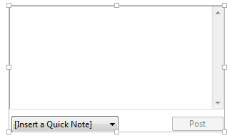
Creates a note entry field, similar to that found in the Operator Notes page. Operators can use this to add notes to a preselected Notebook without leaving the page to which this widget was added.
Alarm Lists and Related Tools:
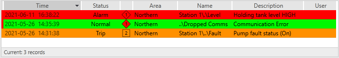
Used to draw a customizable alarm list on any application page. This is what you see in the The Alarm Page, including all tools and filters. When drawing your own list, you have control over which portions of it are shown and how they are configured. You can recreate the alarm page (all options enabled), create a minimalist alarm banner, or some variation in-between.
Alarm list as a simple banner.
If you choose to hide groups of tools, then operators cannot change the values that you set. This banner example shows no tools and uses a column format that does not provide an Ack button. The status bar, border and column titles are still enabled.
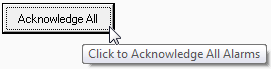
Acknowledge all alarms. This is different from the Ack Shown button. With this tool, "all" means "all", not just "all within the filtered list".
This button is enabled only if there are alarms to acknowledge and you are authorized to acknowledge them
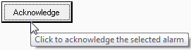
Click to acknowledge a single, selected alarm from a named Alarm List.
This button is enabled only when the logged-on operator selects an unacknowledged alarm.
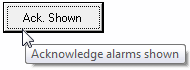
Creates a button that can acknowledge all alarms shown in the named alarm list. Alarms that are not shown because they do not match the list's current filter, are not acknowledged.
Enabled only if the list has alarms that require acknowledgment, and if the logged-in operator is authorized to acknowledge them.
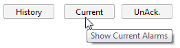
Change the Alarm List to display a different category of alarms. There are 6 possible alarm list categories (Active, Current, Configured, Disabled, History, Unacknowledged). Draw one instance of the alarm list button for each category that you might want to see displayed in the list. (See: Legacy Alarm List)
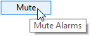
When clicked, this button will stop all alarm sounds (current and future). No alarm sounds will occur while this button is toggled on. Enabled only when there are alarms to mute and the current operator is permitted to use this feature.
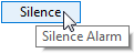
Silence the alarm sound associated with the most recent unacknowledged alarms in your system. New alarms will sound. This button is enabled only when there are alarms to silence and the current operator is permitted to use this feature.
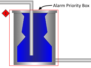
Provides a visible indication when the linked tag is in an active or unacknowledged alarm state, and when it is either shelved or disabled.
The box is not visible for alarms that are unacknowledged but no longer active unless the property AlarmPriorityIndicatorShowNormalUnacked is set to 1. (Note that "trip" alarms are never in an active state.) The icon is always displayed when the alarm is shelved or disabled.
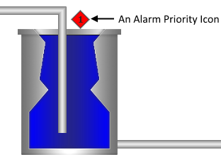
Provides a visible indication when the linked tag is in an active or unacknowledged alarm state, and when it is either shelved or disabled.
The icon is not visible for alarms that are unacknowledged but no longer active unless the property AlarmPriorityIndicatorShowNormalUnacked is set to 1. (Note that "trip" alarms are never in an active state.) The icon is always displayed when the alarm is shelved or disabled.
Used by: I/O and Calculations tag (although portions may be used by any analog numeric tag).
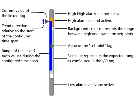
The Analog Bar and Indicator provides a wealth of current and historical data to the operator at a glance. You have a wide range of configuration options. Note that colors used within the bar are controlled by the attached Style Settings tag.
Click to expand
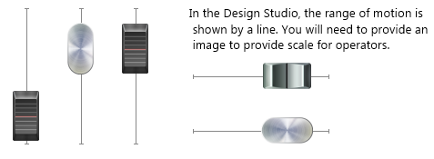
Vertical, left configuration of the Analog Bar and Indicator widget
The Analog Clock widget is a dynamic image, displaying the current time.

The Animated Image widget is used to display a short movie that runs while the tag’s value is non-zero. When used for tags that have analog values, the speed of the animation reflects the value of the tag. For tags with simple on or off values (digitals) the animation either runs or not. In all cases, you can set the maximum speed of the animation in frames per second when configuring the widget.
A configured Animated Image (shown in multiple frames).
The Antique Bolted widget represents the associated tag's value as a photorealistic meter
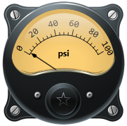
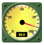
The Antique Gauge widget represents the associated tag's value as a photorealistic meter. The divisions used to display the scale range are pre-set for this meter. The engineering units of the linked tag are displayed below the scale.
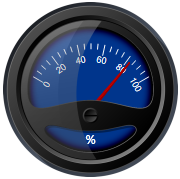
The Aqua Gauge widget represents the associated tag's value as a photorealistic meter, displaying both labeled major divisions and unlabeled minor divisions, the dial of which fluctuates according to the tag's value.

The Arc widget represents the associated tag's value as portion of an arc. The darker portion of the arc starts at the angle you specify, where vertical (North) is zero degrees. Increasing values are indicated by the darker portion sweeping in a clockwise direction. The colors are set by the LED (analog) values of a selected Style Settings tag, and values above the linked tag's alarm setpoint can be indicated.
Four variations on a theme, showing the control you have over arc configuration.
The Army Gauge widget represents the associated tag's value as a photorealistic meter, displaying both labeled major divisions and unlabeled minor divisions, the dial of which fluctuates according to the tag's value.
The Audio widget represents the associated tag's value as photorealistic meter.
The Backlit Gauge widget represents the associated tag's value as a photorealistic meter, displaying both labeled major divisions and unlabeled minor divisions, the dial of which fluctuates according to the tag's value.

This widget is used to display the values of a set of tags in the form of a two-dimensional bar graph. The graph updates continuously with changing values.
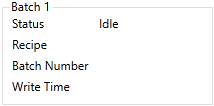
The Batch Status widget is used to display information about a recipe batch. Details include the name of the linked recipe tag, the current status, the recipe name, batch number and the last write time.
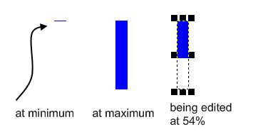
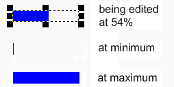
The Bottom Bar widget is used to display a tag's value as a vertical bar, the length of which increases from the top towards the bottom as the tag’s value increases. When the tag’s value is at a minimum, the bar will be shown as a thin line at the top of its range. When the tag’s value reaches its maximum, the widget will be displayed as a rectangle, filling the range.
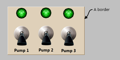
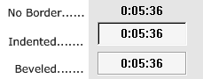
Borders are most often used to provide a visual indication to operators that a set of controls have some common purpose. Borders can appear raised or sunken relative to the rest of the page, and can be transparent or shaded.
The Camera Viewer widget is used to display the live feed from the camera specified in the linked Camera Tag.
Within the Idea Studio, this widget shows only as a placeholder, never as a live image. In the operator view, it will display the feed from the attached camera if available. If the image feed is not available, then a gray rectangle is shown instead.
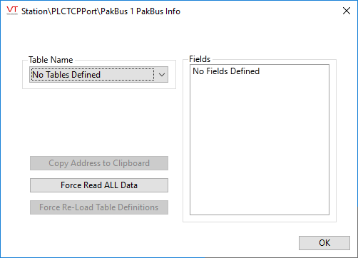
Campbell PakBus Driver Info Widget
The driver needs to read in a set of Table Definitions from the logger before it can read records. This dialog shows operators what definitions have been read. Select a table from the droplist to display a list of the fields.
Cancel Button - See Execute / Cancel Button Widget
The Checkbox Switch widget is used to create an On/Off control for a two-position SelectorSwitch tag. Each time an operator clicks on the box or attached label, the switch will toggle between positions and a check mark will be displayed for position 1.
This is a control-type widget that is only available for selector switches - it is not available for use as an indicator with Digital Input or Digital Status tags.
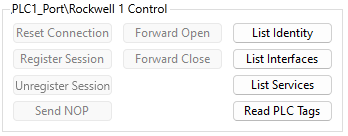
The Rockwell Control tag widget creates a panel of controls that can be used to send output to the hardware associated with a Rockwell driver tag.
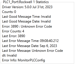
The Rockwell Statistics widget is used to create a beveled display, listing the statistics about the communications between VTScada and the associated hardware.
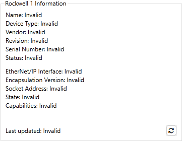
The Rockwell Information widget is used to create a beveled display, listing information about the associated hardware.
The Classic Gauge widget represents the associated tag's value as a photorealistic meter, displaying both labeled major divisions and unlabeled minor divisions, the dial of which fluctuates according to the tag's value.

The Cockpit Gauge widget represents the associated tag's value as a photorealistic meter, displaying both labeled major divisions and unlabeled minor divisions, the dial of which fluctuates according to the tag's value.

The Color Blink tag widget is used to create a color box that blinks to indicate the state of the underlying tag. Blinking is an extremely eye-catching visual feature and should only be used in situations where it is of utmost importance for an operator to notice the state of a tag. Do not use this widget casually.

The Color Box widget is used to represent the associated tag as a box that changes color based on the tag's value. It is primarily used with that have discrete states such as digitals and alarms, but may also be used with analogs. For an analog tag, the value will be rounded to find the closest match to one of the states.

The Color Fill tag widget is used to draw a tag as an animated bar (Bar Color) that graphically illustrates the value of the associated tag against a background color (Unfilled Color).
If the Changed Color is set, the object must be placed over a region of that color to be visible.

The Color Line tag widget is used to draw a line that changes any combination of color, width and style to indicate the state of the associated tag. Can be linked to most numerics, but meant primarily for digitals.
The Comm Indicator tag widget is used to draw an indicator square, the color of which indicates the current status of the associated I/O device.

The Comm Line tag widget is used to draw a line that changes any combination of color, width and style to indicate the state of the associated tag. Used for port tags rather than digitals.
The Comm Messages Button tag widget is used to draw a button that can be clicked to display communications data (transmit and receive communication message strings) for an associated communication driver tag.
The communications Show Statistics Button widget is used to draw a button that can be clicked to display communication statistics for either the device associated with the button, or all devices in your system.
Displays a compass having a needle that rotates according to the tag's value. The compass needle will point to North when the tag's value is 0. Direction of rotation is clockwise for positive values. The full range of the underlying tag's scaled values will cause one rotation.
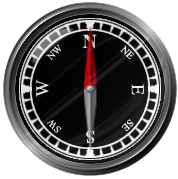
Displays a compass having a numeric display that rotates according to the tag's value. The 0-value will point to North when the tag's value is 0. Direction of rotation is counter clockwise for positive values. The full range of the underlying tag's scaled values will cause one rotation.

Connection Status Indicator Widget
The Connection Status Indicator is used to notify operators when the port being monitored is in any of the following states: Disconnected, Connecting, Connected, or Failed.
You may configure the indicator to use any color for each state, and to use any image (or none) to display the status. The default configuration is a color-coded rectangle. Note that the rectangle is solid - it will not interact with active orange as is the case with an Image Change widget.
This is a multi-use widget for Control Tokens that both indicates current token status and affects token behavior.

Custom Meter Parts:
The compass indicator widget represents the associated tag's value as a needle that swings from the defined reference angle through a full circle in response the linked tag's value.
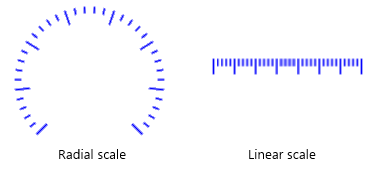
The draw scale provides tick marks to custom widgets of your own design. These may be radial or linear.
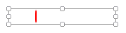
The linear indicator widget represents the associated tag's value as a line that moves across the scale range. Any image may be used in place of the line, but it should have a clear pointer to help the operator read the current position of the meter.
The Linear Legend Widget represents the associated tag's minimum and maximum scale range as a series of numbers in a line. The widget can be oriented either vertically or horizontally. Text can be configured to a set size, or to scale with the widget. In the following example, the horizontal legend has a smaller width than the vertical legend, therefore a smaller font is used.
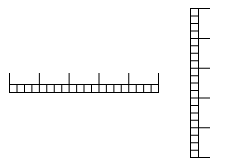
The Linear Scale Widget represents the associated tag's minimum and maximum scale range as a series of major and minor tick marks. The widget can be oriented either vertically or horizontally.
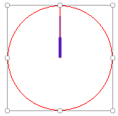
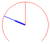
The radial indicator widget represents the associated tag's value as needle rotating about a fixed center. The red lines shown here are not visible to the operator. They show only in the Idea Studio, as a guide to help you place the indicator. The needle may be any image, any color.
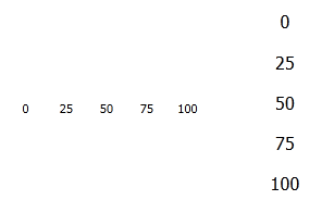
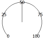
The Radial Legend widget represents the associated tag's minimum and maximum scale range as a series of numbers around an arc.
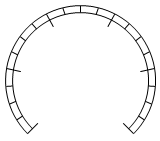
The Radial Scale Widget represents the associated tag's minimum and maximum scale range as a series of major and minor tick marks. The scale will always be round, regardless how the bounding box is stretched. In all cases, the smaller dimension of the bounding box will be used to set the diameter of the scale.
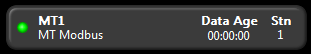
The Data Age tag widget is used to display the time of the most recent poll of an RTU in hours, minutes, and seconds.
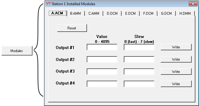
The Data Flow Station Draw tag widget is used to create a button that an operator may click to view information about the modules that have been installed at the physical RTU being represented by the associated tag. The contents of this window will vary according to the station's installed modules.
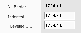
The Draw tag widget is used to display a bordered field containing the description of the associated tag on the left, and its value to the right. The description and the border are optional.
If the associated tag type includes an alarm setup then orange dots will appear in the object to indicate that one or both alarms are either not configured or not enabled. For tag types that have both high and low alarms as part of their definition, the upper and lower squares refer to the high and low alarms in that order.
Add a scalable view of the Historical Data Viewer to any page as a widget. This widget is designed to be linked to a parent tag, which may be either a Context, or a user-defined type that was created from a Context tag. Alternatively, you may select an existing pen group for it to display.
The Draw Text widget is used to display the current value of any of a tag as text. Units (if any) will not be displayed and numeric values will display either 0 or 8 decimal points with no option for user-configuration. If you require just one decimal points of accuracy, or if you would like to display the engineering units that the value represents, then the Numeric Value Widget will be a better choice.
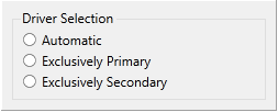
The DriverSelect widget is used to provide operators with a means to select one of the configured drivers to use exclusively, or to allow the DriverMUX tag to work automatically.
Droplist Control Widget (Legacy version)
The Droplist widget can write an operator-selected value from a defined list to an output device. The write occurs when a value is selected in the list. Use of the confirmation dialog is suggested.
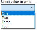
If the linked tag's Questionable Data flag is set, a question mark will be shown before every item in the list.
When displaying Memory Tags that are configured to allow the value to be cleared, the first entry will be "No Data", having a value of "Invalid".
The Edit Property Checkbox widget provides a way for operators to switch a specific property on and off. You choose which property can be edited when configuring the widget. These widgets can allow access to certain properties that need to be updated, without granting operators full access to the Application Properties dialog.
If the property can have values other than zero and one, use the Edit Property Field widget.
The Edit Property widget is used to allow operators to change an application property value. You choose which property can be edited when configuring the widget. These widgets can allow access to certain properties that need to be updated, without granting operators full access to the Application Properties dialog.
If the property can have values of only zero and one, use the Edit Property Checkbox widget.
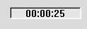
The Elapsed Time widget is used to display the current value of a Totalizer tag using a time format in hours : minutes : seconds.
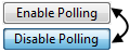
Enable Polling Checkbox Widget
Use this widget to give operators the ability to enable or disable polling without needing to open the Polling Driver's properties dialog. Operators must possess either the Modify Tags privilege or the Manual Data privilege to change this setting.

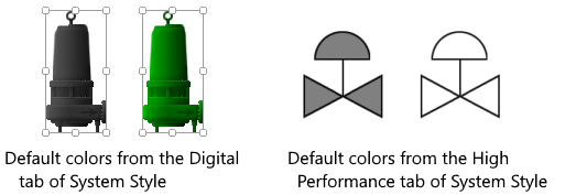
Equipment / Status Color Indicator
Status color indicators can be found in the folders Equipment, Indicators >> Basic, and High Performance. These are images of equipment or ISA symbols that take their color from a Style Settings tag. You can choose whether the indicator should use the style for Digitals, High Performance, or an Equipment type.
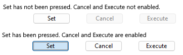
Execute / Cancel Button Widget
The Execute / Cancel Button widget is used in combination with either a Set Value Button Widget or a Numeric Entry Widget when that widget's confirmation option is configured to Set Before Execute. This button must be linked to the same I/O tag as the Set Value button or Numeric Entry widget, and that tag must be configured to write.
The exception is if the Set Value uses a separate Feedback tag, in which case this button must be linked to that feedback tag. Refer to the configuration example in the topic, Set Value Button Widget.
The Export Comm Log Widget is a button that users can press to export communication log files instantly rather than waiting for a time or numeric limit to trigger the write.

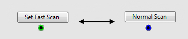
The Fast Scan widget is used to draw a button that the operator can use to control the poll rate for the associated station. The following example shows a polling driver site draw below the fast scan button. A green outer ring in the site draw indicates normal polling while a blue outer ring indicates that fast scan mode has been enabled.
Three styles of folder are provided in the palette, but these are all variations on the same widget.
A frame is similar to a border, except that it provides a much greater range of formatting options. Frames are used in the construction of Folders.

Three frames.
The Glance widget represents the associated tag's value as a pointer needle within a bounding arc. There are no scales.

The Glass Gauge widget represents the associated tag's value as a photorealistic meter, displaying both labeled major divisions and unlabeled minor divisions, the dial of which fluctuates according to the tag's value.
The grid shape creates a rectangular area of any color, visually divided into smaller rectangles by lines.
The background and the lines can be given any color you prefer, or either can be made transparent. Lines may be solid or dashed.
Grundfos Custom Data Log Widget
Used by: Grundfos CU36X Pump Controller Custom Data Log tag to display information collected by that tag. Data beyond Timestamp depends on configuration of your Grundfos controller.
Used by: Grundfos CU36X Pump Controller Event Log tag to display information collected by that tag.
Create a button that opens an Historical Data Viewer window with a preselected set of tag values, over a preset time range. The HDV page that opens will include all of the standard tools for changing the tag selection, legend, time range and scale factor.

Create a hotbox that opens an Historical Data Viewer window with a preselected set of tag values, over a preset time range. The HDV page that opens will include all of the standard tools for changing the tag selection, legend, time range and scale factor.
Because hotboxes are not visible until the pointer is over them, you are advised to add a label that will help operators find this control.

You can monitor the operational status of all of the Historian tags in your application using the Historian Status widget. Many developers choose to create a page that is dedicated to monitoring the state of their application. The Historian Status widget is usually placed in a prominent location on such a page.
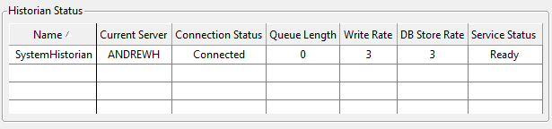
You can find this widget in the palette folder: Analytics >> Trends & Historical Data
When linked to an analog or digital tag as its data source, the History Stats Value widget will display any one of a selection of statistics about that tag's value. The time span for the statistic must be specified by the operator. You can also allow them to display a different statistic.
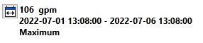
The widget updates its value only when the dates are adjusted, and the selected dates are saved per-user session
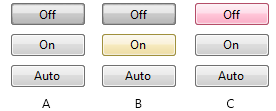
The Horizontal Button widget, one of the native widgets for Selector Switch tags, is a control method used to output one of three possible values. The values will be those configured for the three positions of the selector switch, 0 to 2 in order from left to right.
Horizontal buttons in a normal operating state:
A component of the Analog Bar & Indicator Widget. Refer to that topic for a full discussion.
You may use this widget to build your own custom High Performance HMI widgets.

Bar showing most features enabled
A component of the Analog Bar & Indicator Widget. Refer to that topic for a full discussion.
You can use this widget to build your own custom High Performance HMI widgets.

Indicator showing a recent trend direction
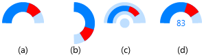
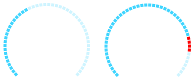
The High Performance Radial Gauge widget is a radial version of the HP Analog Bar widget.
This example uses default colors and shows an expected range, recent values, a high alarm (high priority) and a low alarm (critical priority). The widget gives you the option of displaying the alarm ranges using either the matching priority colors or gray.
Illuminated Toggle Switch Widget
The Illuminated Toggle Switch widget is a control method used to output either of two possible values. When used with a digital I/O tag, the switch will send a 1 for on and a zero for off. When used with a Selector switch, the values will be those configured for the first two of the three possible positions of the selector switch.
The Image Change is a flexible widget, used to indicate a change in state of its associated tag by any of several methods.
Indicator Lights can take many forms. Each form is composed of a light and a frame. You can select different lights and frames for each indicator that you have drawn, mixing and matching the pieces.

The text displayed comes from the linked Style Settings tag (Default if not selected). To use this widget you must:
- Create an I/O and Calculations tag and assign an Equipment Type.
- Create a set of Value entries in a System Styles tag for that Equipment Type.
The Last Logged Value widget is used to display the value last written to a log file (if any), for either a Totalizer tag or a counter tag.
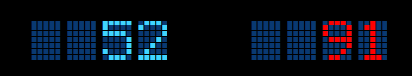
The LCD 5x7 Matrix widget represents the associated tag's value as an dot matrix (LED) display. An active alarm will cause the numbers to use the alarm color.
The LCD 7 Segment widget represents the associated tag's value as an LCD display. An active alarm will cause the numbers to use the alarm color.

The LCD Arc widget represents the associated tag's value as a series of tick marks, a percentage of which are highlighted according to the tag's value. An option in the configuration enables the meter to display alarm values as red tick marks beyond the alarm set point.
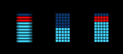
The LCD Bar widget represents the associated tag's value as an dot matrix (LED) display. If configured, an active alarm will cause the dots above the alarm set point to use the alarm color. Two versions are included in the palette: one with a single column of wide images and one with an array of small images.
The LCD Meter widget represents the associated tag's value as speedometer type of gauge with a series of tick marks, a needle, and a numeric scale. A percentage of the tick marks will be highlighted according to the tag's value. The numeric portion of the meter will flash red when the linked tag is in an alarm condition.

The LCD Ring widget represents the associated tag's value as a highly stylized meter, with a numeric display and a series of tick marks, the number of which fluctuates according to the tag's value. An option in the configuration enables the meter to display alarm values as red tick marks beyond the alarm set point.

The Left Bar widget is used to display a tag's value as a horizontal bar, the length of which increases from the right towards the left as the tag’s value increases. When the tag’s value is at a minimum, the bar will be shown as a thin line at the right edge of its range. When the tag’s value reaches its maximum, the widget will be displayed as a rectangle, filling the range.

Legacy Set Value Button Widget
The Legacy Set Value Button tag widget is similar to the Push Button widget, but with a plain appearance and more options. It is used to create a button that operators can use to write any given value to an RTU or PLC.

A typical Legacy Set Value button
Legacy Set Value Hotbox Widget
The Legacy Set Value Hotbox tag widget is identical in function to the Legacy Set Value Button widget. The difference is only in its appearance in your applications. Where the Legacy Set Value Button widget creates a click-able button, the Legacy Set Value Hotbox creates only a rectangular hotbox marking an area where the operator can click. It is up to you to make it clear to the operator what will happen when the hotbox is clicked.
One way that this widget might be used is superimpose hotboxes over an image of equipment from your facility. The boxes should be located over the controls familiar to the operators.

A typical Legacy Set Value hotbox. A label or other target is recommended.
The Linear Gauge widget represents the associated tag's value as a photorealistic meter, displaying both labeled major divisions and unlabeled minor divisions, the dial of which fluctuates according to the tag's value. This meter displays the tag’s value as text, and includes the engineering units in addition to the dial.

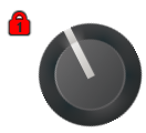
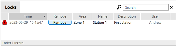
A Lock Level Box is an Alarm Priority Box, configured to indicate that a Control Lock exists and to show the associated Lock Level number.
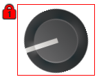
A Lock Level Icon is an Alarm Priority Icon, configured to indicate that a Control Lock exists and to show the associated Lock Level (priority) number.
A Locks List widget is an Alarm List widget, configured to display active Control Locks.
Used in association with the Alarm Notification System, the Make Active tag widget will create a button that can be clicked to select the associated Roster tag as the active roster. This is used to select who will be contacted by the call-out system in the event that an alarm has been triggered and has gone unacknowledged for a defined period of time.
The Metal widget represents the associated tag's value as photorealistic meter.
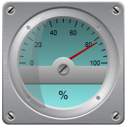
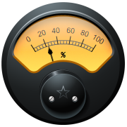
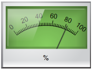
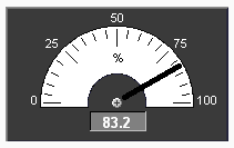
The Meter 1 widget is used to represent the associated tag's value as a round meter whose dial fluctuates according to the tag's value, and which also displays the value as text. The engineering units of the tag (% in this example) are also shown.
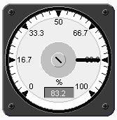
The Meter 2 widget is used to represent the associated tag's value as a half-round meter whose dial fluctuates according to the tag's value, and which also displays the value as text. The engineering units of the tag are also shown.
The Meter 1 widget is used to represent the associated tag's value as a numeric display, including the engineering units of the tag (% in this example) in the lower right corner.

Modem Tools Library
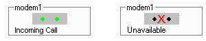
The Modem Indicator widget displays a graphic of an active modem control, showing the name of the associated Modem tag. When the associated modem is dialing out or answering an incoming call:
- The widget will flash (green and red activity lights will flash on the control when the modem is active).
- The text "Incoming Call" will be displayed (for incoming calls).
- The number being dialed will be displayed (for outgoing calls).
If the modem has failed for whatever reason, a red X will be drawn through the image.
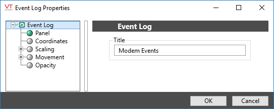
With the Event Log tool you can draw a list that displays the last 256 entries from the Modem Manager's internal log buffer. The most recent entries are shown at the bottom of the list.
Create a button that the operator can click to save the Modem Manager's internal log buffer to a file for later analysis. View this file with the Event Log List.
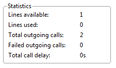
Use the Statistics tool in the Modem Tools folder of the Widgets palette to draw a list of modem call statistics for analysis.
This differs from the Event Log List, which is used to view the modem entries in the Modem Manager's internal log buffer.
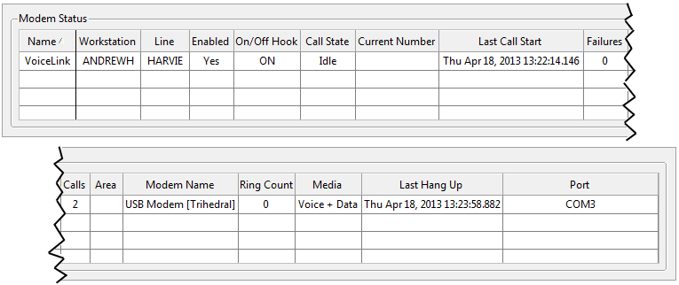
Use the Status tool in the Modem Tools folder of the Widgets palette to draw a list of modem status information for monitoring. Use this tool's properties dialog to view information that is available for each modem. Use the buttons in the center column to select the status monitoring values that you wish to display.
The Momentary Button widget is used to draw a button that will send one value when pushed and the same or a different value when released. Both the value to write when pushed, and the value to write when released, must be provided before the button will be enabled. While similar in appearance to a Legacy Set Value Button Widget, it has a very different purpose.
The Multi-color tag widget is used to display a variety of rectangular color swatches in response to changing conditions within the application.
The Multi-Line widget is not linked to any tag. It can be found within the Widgets palette, within the Tools folder >> Standard sub-folder.
The Multi-text tag widget displays a variety of messages, each in its own color, in response to changing conditions within the application.
The Multi-Write button is used to create a button, with which operators can trigger the operation of a Multi-Write tag.
The Multi-Write hotbox is used to create an area that operators can click within to trigger the operation of a Multi-Write tag.
The Nautical Gauge widget represents the associated tag's value as a photorealistic meter, displaying both labeled major divisions and unlabeled minor divisions, the dial of which fluctuates according to the tag's value.
The Network Link tag widget is used to draw a line indicating the value of the associated Network Status tag. It can tell an operator whether the network link is active, broken or if its current status is unknown.
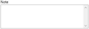
Creates a display area on a page for notes that have been added to the associated Notebook tag. A scroll bar will be added to the right edge of the widget when there are more notes than will fit in the given area.
The Numeric Entry widget is used to create an entry field into which operators may enter numeric values to write to the associated PLC or RTU. If the Questionable flag is set on the linked tag, the indicator will be displayed to the side of the text field, within its own box.
The Numeric Value widget is used to display the current value of any of a tag as a number. Units (if any) will be displayed, depending on how you configure the object.
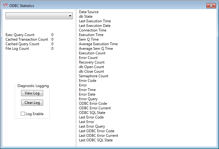
The Show Stats widget for the ODBC manager provides a click-able button that operators can use to view connection statistics.
When drawn on a page, this button provides a link to open the Historical Data Viewer as a pop-up with predefined settings for pen group and time duration.
Found in the Standard Library folder of the Widgets palette. When drawn on a page, this hotbox provides a link to open the Historical Data Viewer. This tool differs from the Historical Data Viewer entry in the menu in that it can be preconfigured to open a particular pen group and display a pre-set time duration.
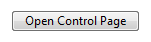
The Page Button widget is a navigational tool, used to create a connection from one page to another.
Buttons are always visible, and can be configured with their own label so that operators will know what to expect when they click.
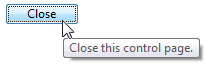
The Page Close Button widget is a navigational tool, used to allow operators to close pop-up pages. Some operators may find that a Close button is more convenient to use than the "x" in the upper right corner of the window.
Page Close buttons do not operate on full-screen pages. Operators may close only pop-up (windowed) pages.
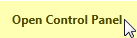
The Page Hotbox widget is a navigational tool, used to create a connection from one page to another.
The hotbox is invisible unless the pointer is over it, at which time it turns yellow (or any other configured color). It is common to place a hotbox around a text label or an image so that operators will know where to find it, and what page to expect when they click.
This widget is used to display the relative values of a set of tags in the form of a two-dimensional pie chart.
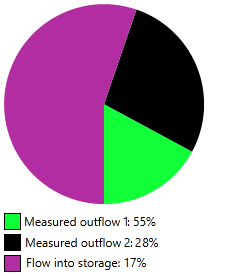
The chart updates continuously with changing values. The current sum of the included tags is taken as 100% and each slice of the pie represents the matching tag's contribution to that total.
The Pie widget represents the associated tag's value as portion of a circle. The darker portion of the chart starts at the angle you specify, where vertical (North) is zero degrees. Increasing values are indicated by the darker portion sweeping in a clockwise direction. The colors are set by the LED (analog) values of a selected Style Settings tag, and values above the linked tag's alarm setpoint can be indicated.

Relevant only to the PLC Alarm Tag. Allows limited configuration of the PLC alarm associated with the linked tag.
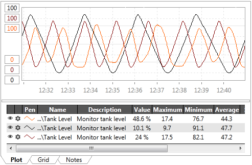
The Plot Data tag widget is used to plot the value of the tag being drawn on a graph similar to that displayed on the Historical Data Viewer page.
The Polled Station tag widget is used to display the number of the RTU being polled.

The Power widget represents the associated tag's value as a photorealistic meter.
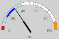
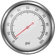
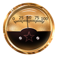
The Pressure Gauge widget represents the associated tag's value as radial meter.
The Program Spawn widget is drawn as a button on any page. In response to being clicked, it will run any configured program that can be found on your computer.
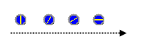
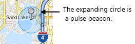
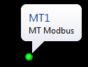
The Pulse Beacon widget indicates the selected site on a map. It is one component of a site icon and is not meant to be used alone.
The Push Button widget provides a method for operators to issue control actions, via the linked tag. The widget's configuration holds the value that will be written to the linked tag when the button is clicked.

The Quarter Arc Gauge widget represents the associated tag's value as a photorealistic meter, displaying both labeled major divisions and unlabeled minor divisions, the dial of which fluctuates according to the tag's value.

Equivalent to the Delete button from the Recipe Page.
Operators can use the Delete button widget to remove the currently selected version of a recipe. If there are no more versions, the current recipe will be deleted.

Equivalent to the Export button from the Recipe Page.
Operators can use the Export button widget to write the ingredients of the currently selected recipe to either an Access or an Excel file.

Notes are associated with batch runs, and can be required by the Start button.
Optionally, you can use this widget to create a text entry field where operators can create a note to be used by the next batch run.
Operators can use the Retrieve button widget to read the current values of recipe ingredients from a PLC. This will query the PLC to which the selected Recipe Book is connected. If no values are available, matching the ingredients in the Recipe Book, all recipe values will be set to blank.
This tool may be useful to let the operator know what ingredient values were last being used in the PLC.
If the "Recipe Name" Ingredient tag has an address, that value will be read out of the PLC as well and will be shown in the recipes droplist. This lets the operator know what recipe the PLC was last running. The same is true for the Ingredient tag, "Recipe Version".

Operators can use the Revert button widget to discard unsaved Ingredient values and reload the saved values for the currently selected recipe and version, associated with the linked tag.

Operators can use the Save button widget to write the current set of Ingredient values to the currently selected recipe and version in the linked tag.

Operators can use the Save As button widget to store the current set of Ingredient values to a new recipe or version associated with the linked tag.

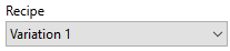
Operators can use the Recipe Selector widget to choose which recipe to run. Recipes must already exist within the linked Recipe Book tag.
Operators can use the Update button widget to write new values to a running batch process for the currently selected recipe & version. This action is protected by a security privilege. The button is enabled only while a process is running.

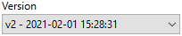
Operators can use the Version Selector widget to select which version of a recipe to process. The drop-down control is enabled only when there are versions to choose from.
The Release Token Button widget gives users a way to release a Control Token that they had obtained.

The button will be grayed-out / disabled if the user does not have the Control Token. Users other than Control Token Administrators cannot release a token that they do not have ownership of.
Report Tools Library
The Report button tag widget is used to create a button that the operator may click to generate a predefined report. The report must be configured within the associated Report tag, but other widgets are available to allow the operator to change the configuration.
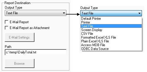
The Report Output Type tag widget is used to draw a group of objects that operators can use to configure the output format and path for their report.
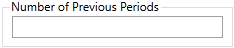
This tool is used to draw a field into which operators can enter the number of report iterations (i.e. consecutive reports) they wish the report generator to produce. For example, if an operator wishes to generate a report for each day in the last month, they could set the report time period to the last day of the last month (e.g. Thu Nov 30, 2001 12:00 pm), and then enter "30" in the Iterations Entry field.
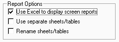
The Report Option List tag widget is used to draw a trio of check boxes that operators can use to select certain formatting attributes for their report.
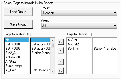
The Report Tag List tag widget is used to draw a group of tools that operators can use to select the tags to be included in a report.
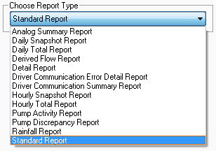
The Report Type widget is used to create a drop-down list from which operators can select the type of report they wish to generate.
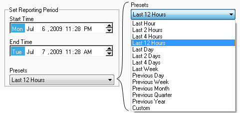
The Reporting Period widget is used to draw spin boxes and a drop-down list that operators can use to configure the time period for a report. The available presets are shown to the right of the completed widget:
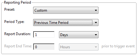
Reporting Period (Enhanced) Widget
The Reporting Period Enhanced widget provides every possible option to configure the time period for a report. You can select from of:
- A set of predefined full time periods.
- A set of predefined time lengths prior to the trigger.
- A custom time period, of any duration and end time.
The Request Token Button widget gives users a way to request a Control Token for an output tag or a set of output tags.

The button will be grayed-out / disabled if the user already has the Control Token. If no-one else has a control token on this tag and if the user is authorized to use the control, the request will be granted immediately. Otherwise, (by default) the request will be added to a queue of people asking for control of the tag. (Use the property, ControlTokenManualRequestOption to alter this behavior if needed.)
The Reset Button widget is used to create a button in your application that will reset a Totalizer tag or a Counter tag to zero.

The Reset Polling History widget is used only by the Enron Modbus Driver. It is drawn as a button, which operators may click to change the next index to be polled back to the first index, which may be a one or zero depending on driver settings. This can be used to re-read all data in the device.

The Reset Target widget is used to create a hotbox that will function in the same way as a Reset Button widget. When an operator clicks on the hotbox, the associated Totalizer tag or counter tag will be reset to its starting value. The reset target is shown as a simple rectangle of the configured color. To make its purpose clear, you should consider placing it above a symbol or text that describes its purpose, as shown here (label added as text).
The Retro Gauge widget represents the associated tag's value as a photorealistic meter, displaying both labeled major divisions and unlabeled minor divisions, the dial of which fluctuates according to the tag's value.
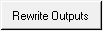
The Rewrite Outputs widget is used to force a driver to re-send the last set of values, written to outputs. The button will be enabled only if the driver has been configured to store the values.
The Right Bar widget is used to display a tag's value as a horizontal bar, the length of which increases from the left towards the right as the tag’s value increases. When the tag’s value is at a minimum, the bar will be shown as a thin line at the left edge of its range. When the tag’s value reaches its maximum, the widget will be displayed as a rectangle, filling the range.
ROC Driver History Info Button
Creates a button that operators may press to access details about the driver's history. This widget will work only with devices that use the ROC Plus protocol..
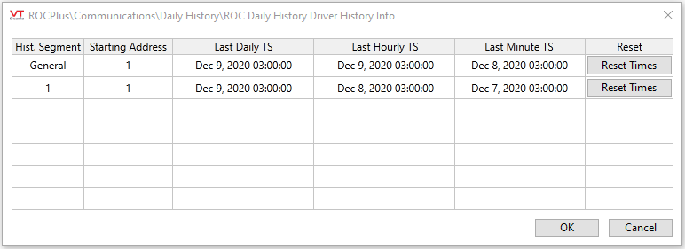
ROC History Polling Timestamp Reset
Creates a button that operators can press to reset all of the device's history addresses, resulting in a full read of the RTU on the next poll, rather than only those records that were added since the last successful poll. This will have no effect on data that has already been saved by the VTScada Historian.
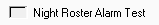
The Roster Alarm Test widget is used to create a check box that operators can click to generate an alarm that will test the roster configured for the Alarm Notification System.
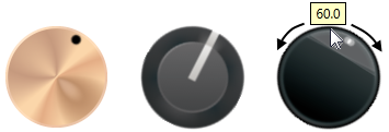
The Rotary Control enables operators to select a value to write to hardware by turning a knob. This is done by clicking on, then dragging the control clockwise or counter-clockwise. The value that will be set is shown in a tooltip while dragging.
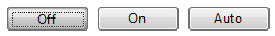
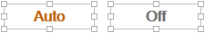
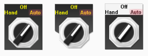
The Selector Switch widget is used to represent a Selector tag as either a 2-position or a 3-position switch. A common use is to create a Hand-Off-Auto selector.
The Service Status widget duplicates the content of the Services Page on a page of your choice within your application. Note that your page must be protected by a custom security privilege that you create. The Service Page Access privilege will not restrict who can view this widget on your page.
Refer to the Services Page for a detailed description of the features of the Service Status widget.
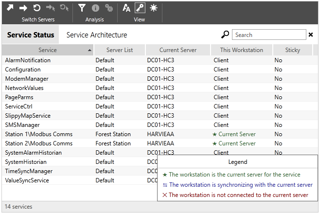
Service Status including the optional legend
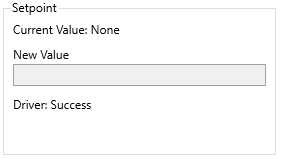
The Set Analog Value widget is used to create a button that operators may click to write a specific value to an I/O address of the associated tag. Several may be drawn to provide a range of value choices. Note that the configured value is not shown as part of the widget - if you would like it to appear (as shown in the following example) the value must be drawn on the page as text.
The Set Value Button widget is used to write a value to an output tag, and has the following features that differentiate it from the Legacy Set Value Button Widget.
- The value to write can come from another tag or an expression.
- Can display a label or an image.
- If using a label, you can select the font.
- Can accept feedback from a tag or expression other than the one used by the linked tag.
- If the feedback value differs from that configured Feedback Value, a mismatch condition will be shown.
- Can be disabled.

A typical Set Value Button widget
The Show Stats widget is used to place a button that will open the ODBC Statistics dialog.

Use the Site Alarm List widget to draw an alarm list that is prefiltered to show only the alarms in child tags of the linked site or context.
It can also be configured to show all alarms in any tag having an Area property that matches the linked site. Or, it can filter for both child tags of the site, and all tags having a matching Area property.
An acknowledge button will be available for each entry, provided that the logged-on operator has the security privilege required to acknowledge these alarms.
Can be drawn directly by the Context tag. Provides the entire content of the Site Details page, but drawn on a page of your choice.
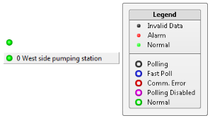
The Site Draw tag widget is used to draw station symbols that represent RTUs These display the status at the station being drawn, using two, concentric color indicators. The Site Draw may be configured to display a label or to show only the indicator circles.
A Site Draw legend is available in the Site Tools folder of the Widgets palette. Adding this to your page will help operators interpret the meaning of the color indicators. The center dot will change color according to the status of I/O within the site - Invalid data or an alarm in any I/O tag will indicted by the dot. The outer ring indicates the status of device driver communication with the site.
The Site Icon Widget creates a color indicator that both displays the status of communications to the associated station and provides a click-able link to the built-in Station Page for the associated station tag. This is very similar to the Site Draw widget, and uses the same color system for its concentric rings.
The Site Summary Widget creates a color indicator that both displays the status of communications to the associated station and provides a click-able link to the built-in Station Page for the associated station tag. It also provides relevant information about the underlying station tag. The full display mode option is shown here:
The Slider widget is used to create an output control. An operator can drag the slider to set a value which will be output by the associated tag.
Used by: I/O and Calculations tag (although portions may be used by any numeric tag).
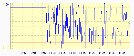
The Sparklines widget is similar to a Plot widget but allows operators to see at a glance whether the tag has values below, within, or above the expected range.
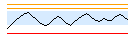
A Sparklines widget for an I/O tag, showing the expected range (blue band),
a low alarm, high alarm and high-high alarm.
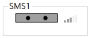
The SMS Modem Indicator widget displays a graphic of an active SMS modem control, showing the name of the associated SMS Appliance tag. It is similar to the Modem Indicator Widget, but displays SMS events rather than a continuous indication of the modem status.
Note the signal strength bars to the right of the device status display, indicating whether your device is receiving an adequate signal from the local tower.
Used by: I/O and Calculations tag (although portions may be used by any analog numeric tag).
The spider graph widget allows operators to see at a glance whether several related tags have values below, within, or above their expected ranges.
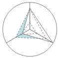
A spider graph showing three tags and their expected value range.
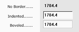
The String Entry widget are used with String I/O tags that are configured to write values. Operators can enter the value to be written in the data entry field. The write operation will happen when focus leaves the field, whether by an Enter, a tab, or a click on some other widget. Characters can be masked for privacy.
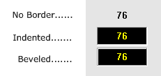
The example is configured to show the optional title and bevel.
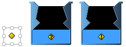
Most VTScada widgets contain a tag icon marker. This is the yellow symbol that blinks a question mark when the linked tag's Questionable flag is set, and an exclamation mark when the linked tag is using manual data. If a widget has not yet been linked to a tag, the indicator will show a star (asterisk).
The Tag List widget provides a highly configurable means of displaying any or all of the child tags attached to a selected parent. If no parent tag is selected, then root of the tag hierarchy is considered to be the parent and any set of tags in the application can be displayed in the list, subject to the configuration of the filtering options.
The Text Change tag widget is used to represent the associated tag's value as a text string that changes (text or color) based on the tag's value. While this widget is available to analogs, it is most commonly used with digital and other tags that have clearly defined states (values from 0 up to 3).
If linked to a tag that has values above 3, this widget uses the modulus (remainder) of the tag's value divided by four. For example, 7 is read as 3.
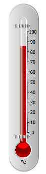
The Thermometer widget represents the associated tag's value as a photorealistic alcohol thermometer.
The Toggle Button widget is used to display an up / down toggle button, providing digital control and feedback.
When the toggle is pressed (or "down") it has a blue highlight and displays the "down" label. When "up", it does not have the blue highlight.
You control whether the signal sent for pressed / down is a zero or a one. The signal sent for "up" will be the opposite.
Use this widget to give operators the ability to enable or disable polling without needing to open the Polling Driver's properties dialog. Operators must possess either the Modify Tags privilege or the Manual Data privilege to change this setting.
The Toggle Switch widget, one of the native widgets for Selector Switch tags, is a control method used to output either of two possible values. The values will be those configured for the first two of the three positions of the selector switch, 0 to 1.
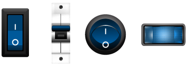
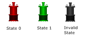
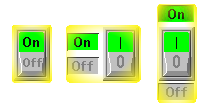
A variety of switch images are available in the Selector Switches images group. A few of the available choices are shown here (for every On image there are matching images for the Off state and the Invalid state, drawn in the same style).
A Tokens List widget is an Alarm List widget, configured to display active Control Tokens.
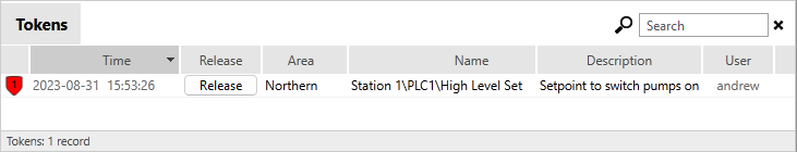
Refer to Control Tokens for a full explanation of what Control Tokens are and how they work.
A Tokens Requests List widget is an Alarm List widget, configured to display active Control Token Requests.
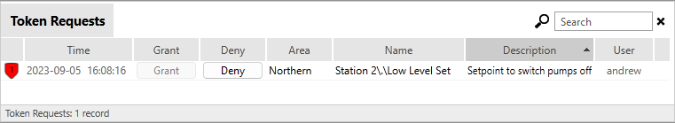
Refer to Control Tokens for a full explanation of what Control Tokens are and how they work.
The Top Bar widget is used to display a tag's value as a vertical bar, the length of which increases from the bottom towards the top as the tag’s value increases. When the tag’s value is at a minimum, the bar will be shown as a thin line at the bottom of its range. When the tag’s value reaches its maximum, the widget will be displayed as a rectangle, filling the range.

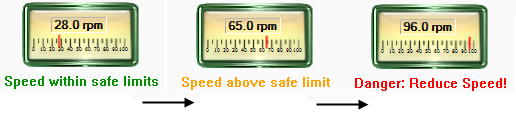
The Two Color Bar tag widget is used to display tag data using an animated, multi-colored bar. Its appearance is similar to the Color Fill widget with the addition of a second color that will be displayed when the value goes above a set point. A common use of this second color is to provide clear notice that a value is above its safe limit.
The Totalizer widget calculates and displays the combined total of the value of the Pulse Input tag being drawn within a user-defined period of time. Each time the user-defined period of hours has cycled, the Totalizer object will automatically reset to 0 and will begin to recalculate.
The Vertical Buttons widget, one of the native widgets for Selector Switch tags, is a control method used to output one of three possible values. The values will be those configured for the three positions of the selector switch, 0 to 2 in order from top to bottom.